2026 Year in Review: The UI Trends That Won and Lost
Glassmorphism held on. Neobrutalism surprised everyone. Here's an honest developer look at which UI styles dominated 2026 and which ones quietly faded out.
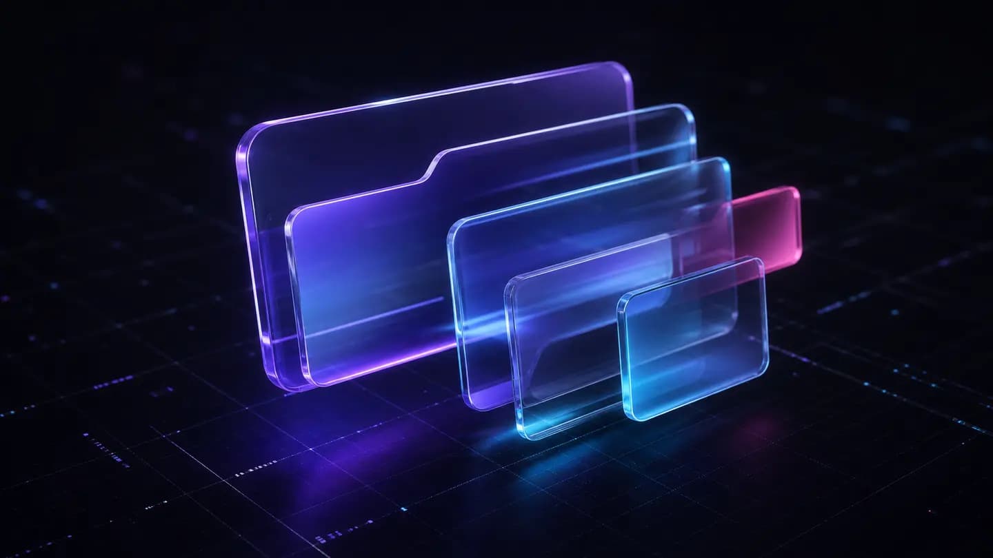
Glassmorphism in 2026: Still Here, Actually
Honestly, glassmorphism refusing to die is the most surprising UI story of 2026. A lot of developers called it dead in 2024. Too gimmicky, too dependent on specific backgrounds, too hard to pull off with real accessibility constraints. And yet here we are in December, and the frosted-glass aesthetic is still shipping in production apps.
What changed is the *how*. Early glassmorphism was sloppy — developers slapping backdrop-filter: blur(10px) on everything and calling it a design system. In 2026, the implementations got tighter. We're talking rgba(255,255,255,0.12) backgrounds paired with border: 1px solid rgba(255,255,255,0.18) borders, not the old 0.4 opacity slabs that looked like someone sneezed on a window.
The what is glassmorphism article we published earlier this year still gets consistent traffic, which tells you developers are still researching this actively. It's not nostalgia. It's genuine interest in getting the technique right.
Neobrutalism's Unexpected Comeback
Nobody on the team predicted neobrutalism would have this strong a year. It started as an indie dev novelty — thick black borders, flat shadows offset by exactly 4px 4px 0px #000, zero gradients. It looked like a GeoCities site that went to art school. And then SaaS products started using it seriously.
The reason it worked is contrast. After years of ultra-subtle glassmorphism and neumorphism, something with actual visual weight felt refreshing. Buttons you could actually find on the page. Cards that didn't require a perfect dark background to read. If you want to understand where it sits relative to other styles, our glassmorphism vs neumorphism breakdown gives good context on the spectrum.
That said, neobrutalism has real limits. It's a terrible fit for anything that needs to feel premium or trustworthy — finance apps, medical dashboards, enterprise tooling. It works for developer tools, indie SaaS, and portfolio sites. Know your audience before you commit.
Neumorphism: The Trend That Never Really Shipped
Neumorphism had its moment in 2020 and honestly never recovered from the accessibility backlash. The contrast ratios are a nightmare — those soft inset shadows on near-white backgrounds fail WCAG AA almost by design. In 2026, it's mostly a curiosity, something designers prototype and then quietly abandon when they try to pass a contrast checker.
There's still a place for it in very specific contexts — high-contrast dark mode implementations where the shadow depth actually reads cleanly, or decorative elements that don't carry interactive meaning. If you want to understand the technique before dismissing it entirely, what is neumorphism is worth a read. But don't build a production UI on it without a serious accessibility audit.
The irony is that neumorphism looked amazing in Dribbble screenshots and fell apart in implementation. That gap between design mockup and real-world usability is exactly why we build component libraries instead of just tweeting about trends.
Claymorphism and the 3D Inflation Aesthetic
Claymorphism — that inflated, slightly 3D, pastel-colored style — had a weird arc this year. It peaked in early Q1 mostly in mobile app marketing, then cooled off significantly. The style is visually engaging but implementation cost is high. You're dealing with complex box-shadow stacks and sometimes actual SVG or WebGL work to get the inflation effect right.
Where it held on was in onboarding illustrations and empty states. Not as a full UI system, but as accent elements. That's probably where it belongs. Check out what is claymorphism if you're curious about the technical breakdown — the key tension is always balancing the playful aesthetic against actual load performance when you're stacking filters and shadows.
For product UIs, claymorphism in 2026 is decoration, not architecture. Use it for a hero illustration or a mascot. Don't build your card system out of it.
What the Numbers Actually Showed: Tailwind and the Component Ecosystem
Let's talk implementation reality. Across the component libraries and open-source repos that shipped this year, Tailwind CSS remained dominant. Tailwind v4.0.2 dropping the JIT-by-default architecture and fully embracing CSS custom properties made a real difference for theming complex visual styles. You could finally do things like this without fighting the compiler:
// Glassmorphism card with Tailwind v4 arbitrary values
export function GlassCard({ children }: { children: React.ReactNode }) {
  return (
    <div
      className="
        rounded-2xl
        border border-white/20
        bg-white/10
        backdrop-blur-md
        shadow-[0_8px_32px_rgba(0,0,0,0.18)]
        p-6
      "
    >
      {children}
    </div>
  );
}
That border-white/20 and bg-white/10 syntax — the slash opacity modifier — is the thing that made glassmorphism composable in Tailwind without writing a single line of custom CSS. That matters. The best free glassmorphism components roundup we did mid-year shows how many libraries leaned into exactly this pattern. And if you're thinking about dark/light mode parity, the theme toggle in React piece is directly relevant — getting backdrop-filter to behave correctly across themes is still annoying.
The Losers: Gradients That Overstayed, Particle Backgrounds, and Flat 2.0
Some things did genuinely fade. Mesh gradients — those multi-point, almost watercolor gradient backgrounds — were everywhere in 2024 and 2025. In 2026 they started feeling dated. Not dead, but recognizable as 'that era.' Same with aurora-style animated gradients as full-page backgrounds. You'd see them and immediately think 'startup landing page, circa 2024.'
Particle backgrounds had an even harder fall. The react-tsparticles pattern of floating dots connecting with lines — that was already tired in 2025, and by 2026 it was a meme. If you're still shipping particle backgrounds, read particles background in React and at least make sure you're doing it with performance guards. Unconstrained particle simulations on low-end hardware are still a battery drain disaster.
Flat 2.0 — that style that tried to be Material Design but with less color — just got absorbed by everything else. It's not really a trend anymore, it's a baseline assumption. Most UI defaults to some version of it when nothing more specific is applied. Which is fine, honestly. Neutral is underrated.
What's Actually Worth Shipping Going Into 2027
Glassmorphism is worth shipping if you have a strong background layer — a gradient, a photograph, an abstract canvas — and you're willing to do the accessibility work. The backdrop-filter support is now universal across evergreen browsers, so the 'but Safari won't render it' excuse is gone. Test contrast ratios on the actual rendered element, not on the background in isolation.
Neobrutalism is worth shipping for developer tools, utility apps, and anything targeting a technical audience that responds to personality over polish. The constraint is staying consistent. The style breaks down fast if you mix it with subtle drop shadows or soft border radii — it needs to be committed. Shadow offset of 4px 4px 0px on interactive elements, border widths of at least 2px on cards, font weights that actually feel bold.
Everything else — claymorphism, neumorphism, aggressive gradients — treat as seasoning, not the main course. And whatever you pick, make sure your component structure makes it swappable. Locking a visual style into your DOM structure instead of your CSS layer is how you end up doing a full rewrite when the next trend hits in 18 months.
Honest Prediction: Where UI Styles Go in 2027
The honest prediction is that 2027 will see more brutalism variants and a resurgence of typography-first design. We're already seeing signs — layouts where text is the primary visual element, not images or UI chrome. It's partly a reaction to AI-generated imagery flooding the space and making stock photography feel less distinctive.
What does that mean for component libraries? It means spacing, type scale, and color systems become more important than ever. A gap: 8px vs gap: 12px decision in a card grid matters more when the card isn't covered in decorative elements. The micro-decisions matter more in minimal systems than in elaborate ones.
Will glassmorphism survive another year? Probably yes, in a more refined form. Will something completely new emerge? That's the question nobody can answer honestly in December. But the developers who understand *why* each style works — not just how to copy the CSS — are the ones who'll implement whatever comes next without starting from zero.
FAQ
Yes, but only when you have a rich background layer for the blur to work against. A frosted glass card on a flat white background looks broken. Use it with gradients, photography, or abstract canvas backgrounds, and always verify contrast ratios on the actual rendered output — not on background colors in isolation.
A solid baseline is: background: rgba(255,255,255,0.12), border: 1px solid rgba(255,255,255,0.18), backdrop-filter: blur(12px), and box-shadow: 0 8px 32px rgba(0,0,0,0.18). Adjust the background opacity between 0.08 and 0.18 depending on how visible the blur layer underneath needs to be.
Yes, significantly. The slash opacity modifiers (bg-white/10, border-white/20) and arbitrary shadow values (shadow-[0_8px_32px_rgba(0,0,0,0.18)]) let you build a complete glassmorphism card without a single line of custom CSS. The CSS custom property architecture in v4 also makes theming across dark/light mode much cleaner.
The core problem is contrast. Neumorphism relies on very subtle shadow differences on near-matching background colors. Those contrast ratios consistently fail WCAG AA requirements for interactive elements. It's also difficult to communicate state changes — hover, focus, active — without breaking the visual metaphor. The style optimizes for a specific screenshot aesthetic, not for actual usability.
Generally no. The thick borders, flat offset shadows, and high-contrast color blocks read as playful or irreverent, which conflicts with the trust signals enterprise buyers expect. It works well for developer tools, indie SaaS with a technical audience, and personal projects. If your buyers are finance teams or executives, stick to something more conventional.
Use it sparingly — don't stack multiple blurred layers. Prefer backdrop-filter: blur(12px) over blur(40px) since larger blur radii are more expensive. You can also use the @media (prefers-reduced-motion: reduce) query to fall back to a solid background for users who've opted into reduced visual effects, which often correlates with lower-end hardware configurations.