EmpireUI
Get Pro
11 guides

Design Systems

Tokens, component libraries, documentation, accessibility and scaling — engineering guides for teams building and maintaining design systems.
Pillar guide
Building Design Systems That Scale: Engineering Guide 2026
The complete engineering guide to building a scalable design system in 2026 — tokens, component APIs, Storybook, Figma handoff, accessibility, versioning, and team adoption in one place.
Read the complete guide → 15 min
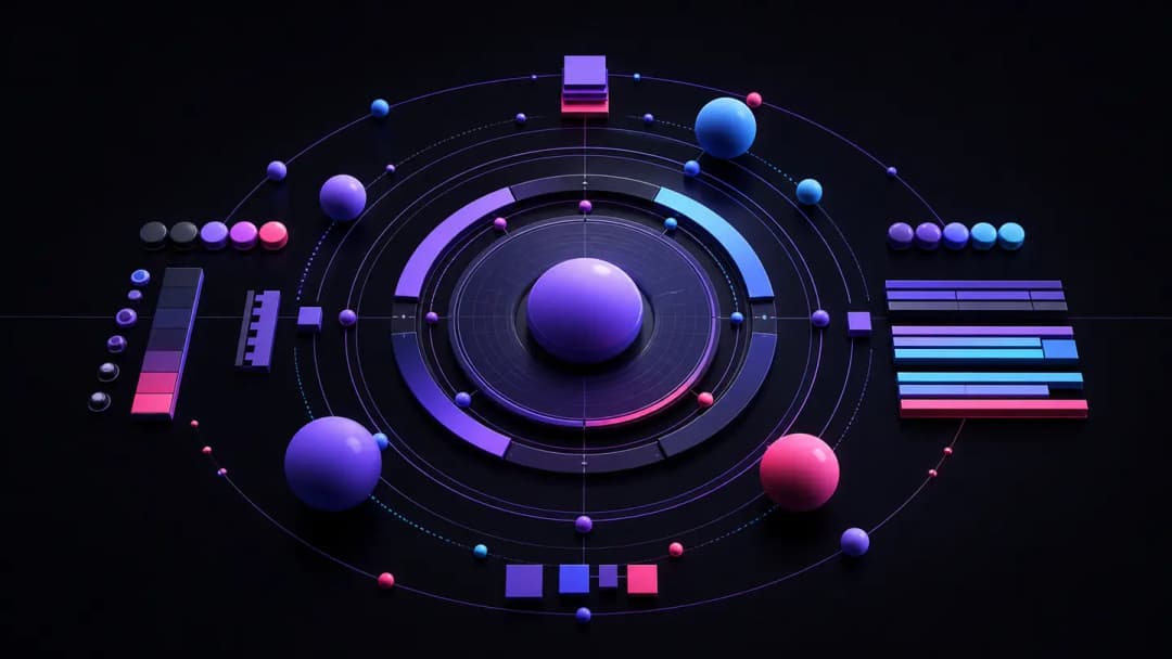
A diagram showing design tokens flowing into React components, documented in Storybook, and consumed by multiple product teams.
All 11 guides
Close-up of clean typographic letterforms on a design grid layout
8 min read
CSS Typography Scale: fluid type with clamp() and modular scale
Learn how to build a fluid CSS typography scale using clamp() and modular ratios — no media queries, no breakpoints, just math that works at every viewport width.
typographyclamp
Read →
Close-up of typographic letterforms on a designer's screen
8 min read
Web Font Loading in 2026: next/font, variable fonts and CLS
Everything you need to know about web font loading in 2026 — next/font, variable fonts, CLS fixes, and why your layout still shifts at 3am.
web fontsfont loading
Read →
Colorful design tokens and CSS variables displayed on a developer screen
8 min read
Design Tokens in 2026: From Figma Variables to CSS Custom Properties
Design tokens bridge Figma variables and CSS custom properties — here's how to build a token pipeline that actually survives a design system at scale.
design tokenscss variables
Read →
developer writing accessible React code on a laptop screen
8 min read
WCAG 2025 Accessibility Guide for React Developers
Everything React developers need to know about WCAG 2.2 and the upcoming 3.0 — from ARIA patterns to focus management, with real component code.
wcagaccessibility
Read →
React icon system components displayed on a developer screen
7 min read
Icon System in React: lucide-react, Heroicons and Custom SVGs
Pick the right icon library for your React app in 2026 — lucide-react, Heroicons, or roll your own SVG system. Here's how each one holds up.
iconsreact
Read →
Colorful gradient swatches on a dark designer workspace background
8 min read
Building a Color System: Semantic Tokens, OKLCH and Dark Mode
Learn how to build a scalable color system using semantic design tokens, OKLCH color space, and bulletproof dark mode — without the CSS variable spaghetti.
color systemdesign tokens
Read →
Developer working on a React component library with TypeScript in VS Code
8 min read
Building a Component Library with Storybook 8 + TypeScript
Learn how to build a production-ready component library with Storybook 8 and TypeScript — from project setup to autodocs, testing, and publishing to npm.
storybookcomponent library
Read →
Designer and developer collaborating on Figma to React component handoff workflow
8 min read
Figma to React: The Workflow That Actually Saves Time
Stop losing hours in design handoff. Here's the Figma-to-React workflow senior devs actually use in 2026 — tokens, auto-layout, and no more pixel-guessing.
figmareact
Read →
Developer writing CSS custom properties code on a dark monitor screen
8 min read
CSS Custom Properties as a Design System: The Right Architecture
Build a scalable CSS custom properties architecture that powers real design systems — theming, tokens, component overrides, and dark mode without the mess.
css variablesdesign system
Read →
Clean CSS grid layout with evenly spaced design system tokens on screen
8 min read
CSS Spacing System: 8px Grid, rem vs px, and Container Queries
Master the 8px spacing grid, know when to use rem over px, and write container queries that actually hold up in production layouts.
spacingcss grid
Read →
Browse other topics
UI Styles (63)Components (30)React (46)Tailwind CSS (14)CSS Animations (17)Developer Tools (12)Comparisons (10)Advanced Techniques (8)
Free components in 40 visual styles
React & Tailwind, copy-paste ready. Glassmorphism, neobrutalism, Y2K and more.
Browse components →